

Key Elements of a Great Infographic

Do you want to create amazing content that people will remember long after they’ve left your site? Are you interested in producing marketing deliverables that are shareable, unique and engaging (and can easily be branded to increase exposure for your company)? If these are your goals – and they should be if you care about bringing more traffic to your site and increasing leads – you need to create an infographic.
What Is an Infographic?
An infographic is a graphic that displays useful data in a creative way. With a unique representation of data that you or other sources collect, you can portray information clearly and artistically. A professional graphic grabs the attention of readers and helps them understand the knowledge you want to present.

This style of imagery isn’t just a way to mix things up, there are proven benefits of including infographics. A HubSpot study found that articles generated 178% more inbound links than normal when they included an infographic. That’s huge in the SEO world! Articles with visual representations of data also got a whopping 72% more views on average.
Why Are Infographics Useful?
Blog content is a great foundation for a content marketing strategy. However, people will only remember so much of the text content they read, while 80 percent of information conveyed visually is retained. Infographics still require the great writing and research that you use in your written content, but they’re laid out and designed in a way that allows people to quickly understand information and remember it for longer.
How to Make a Good Infographic
If you’re new to creating infographics, you may wonder how to make a good infographic. Don’t worry, there are plenty of tools out there to help even beginners create nice-looking graphics. And our guide can help you decide what to include.
If you’d prefer to stay hands-off, these tips are still helpful for compiling research, creating written content and working with a designer to bring your idea to life. With that being said, here are the seven elements used to create effective infographics for your website.
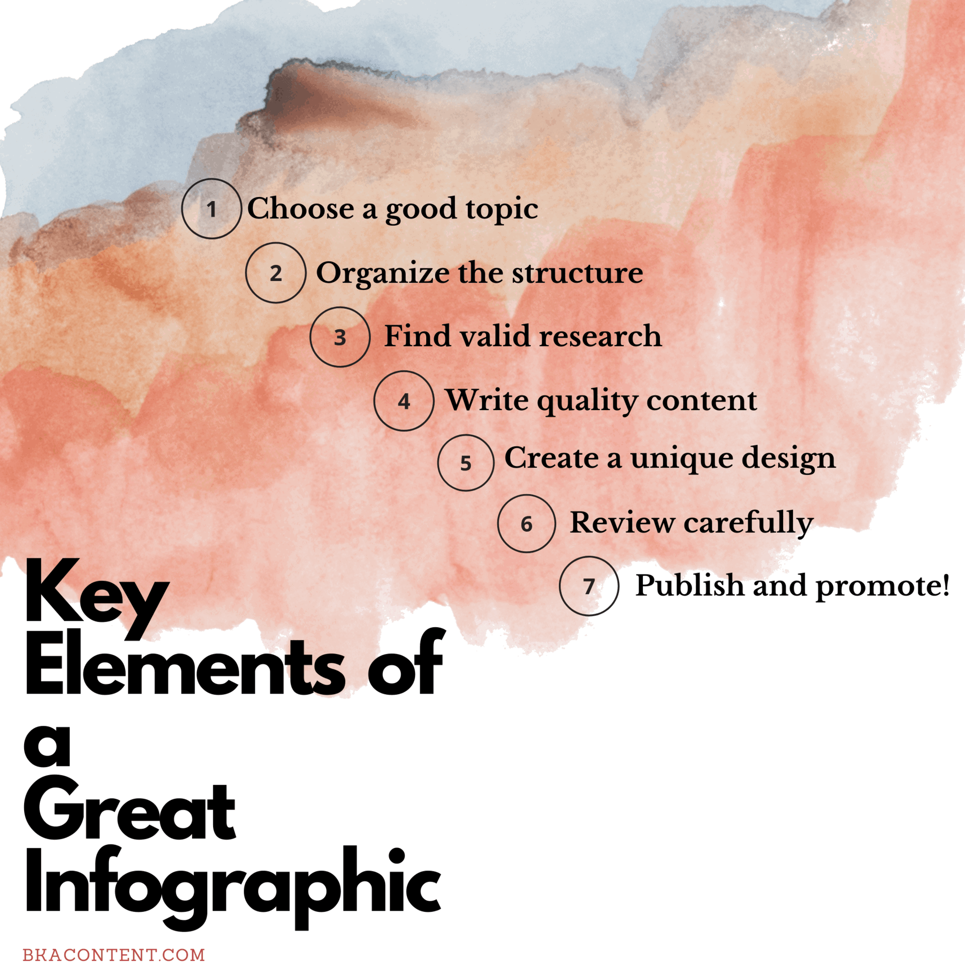
1. A Well-Thought-Out Infographic Topic
Choosing a topic for an infographic is really not that different from choosing a topic for a blog post. In fact, one great method of choosing topics is to USE the information from your blog posts. Go through some of your top-performing blogs and consider how you’d break out the information into an infographic format. Any blog post that has well-structured lists, factual or numerical data, or tells a story are great places to start.

Aside from that, you should select an infographic topic that will matter to your readers and that hasn’t already been overused by others. Think about your industry and come up with infographic topics that people should know about. Whether you’re answering a question, displaying important new research or explaining a difficult concept, it can be useful to readers.
Make sure that whatever infographic topic you choose, you take a structured approach to presenting it to your readers. Instead of simply throwing together a bunch of statistics on a topic area, aim to find the story or the unique focus within the data. When appropriate, give context to the data you’re displaying and show your readers why it’s applicable to them.
2. Infographic Structure
So how do you create the actual infographic? Essentially, infographics are about telling a story with data, but you don’t always have to take the same approach. According to Alberto Cairo in this Marketing Land article, infographics need structure, but not necessarily a narrative structure. Basically, your image needs to make sense in terms of what information you include and how it’s arranged.
This infographic from Funders and Founders, for example, presents productivity tips broken up into a variety of categories depending on what the tips pertain to.

Keep in mind that nice infographic structure is all relative. Some really great infographics are simple and easy to get through, others are more colorful and data-heavy. As far as deciding what design elements to use in order to create a structure, the sky really is the limit. One starting point is to find other good infographics that have resonated with you and follow a similar pattern or style.
3. Legitimate Research and Facts That Wow
Thorough research is important in all content, but in an infographic where interesting facts and figures are usually the main focus, it’s mandatory. After you’ve chosen a subject and a focus, find the data that supports your facts.
If possible, find statistics that your company has already gathered. Check out interesting analytics or surveys you have conducted, and put them into a graphic. However, it isn’t a prerequisite to create your own data for an infographic. Find interesting facts from others who have taken the time and effort to conduct surveys and tests. When possible, find the primary source of the research instead of citing a secondary source (someone who mentioned the primary resource on their site or in their content).
Prioritize NEW Statistics in Your Infographics
With so many infographics out there, you’ll probably notice that a lot of them repeat the same statistics. Some overlap is inevitable, but you should make an effort to find information that is new or surprising to your audience.

Find something that helps them or enriches their life in some way whether that means improving their work strategies, helping them do something better or more efficiently, or informing them about something they didn’t know. Ask yourself: how does this infographic help my target audience?
Include Sources
It’s also good to include a list of all your sources at the end of your infographic for two reasons: first, so you can give proper credit to the people that did the work to find those statistics; and second, so people that enjoy your content can find out more about it from the sources you consulted when making it.
4. Write Quality Infographic Content
Whether you’ve created content just for this image or you are taking from an existing article, infographic content needs to be altered to fit the format. Flowing sentences don’t work for this style. Instead, stick to strong verbs and concise wording. For example, if you’re writing about the process of putting on a mask, make each step comprehensible but short. People want to absorb as much information as they can in as few words as possible.
A quick review of the examples out there shows that there’s a lot of variation in how much text infographics contain compared to the amount of visual imagery. There’s no one right answer to how much text you should include, but it does need to be high-quality and error-free writing.
Pick Good Data
If you’re reusing content from a blog post to make your infographic, the most important task is to pare that content down and use only the most impactful sections for the text of your image. A smart method is to find sections that are data-rich and group those stats together in an image. If your infographic isn’t focused on numbers or data, pick content that is useful and relevant to the topic you’ve chosen.
Create an Infographic Outline First
If you’re creating an infographic from scratch, consider writing up a bare-bones outline for the information you want to include. Write small blocks of text and bullet points that could be used to introduce your content and state your data. Then during the design stage, you can take the outline and rework it into a full infographic, making any needed changes at this point.
5. Thoughtful, Innovative Infographic Design
Whether you’re designing your infographic or you’re handing that part over to a professional designer, have an open mind to all sorts of design, from photographs to flat design to illustrations.
There are many ways to categorize the information you gather. Visme recognized the five most common ways:
- Alphabetically: Just like this bullet point list, you can categorize the information on your infographics A-Z. This helps readers follow without too much effort, and it’s a great way to know what to put first.
- Categorically: Put data in categories, so readers know where to look. If you are looking at a variety of data, this is a great way to organize your thoughts.
- Chronologically: If you are creating an infographic about history or have specific dates, a timeline or other chronological order is the way to go.
- Geographically: Studying demographics in specific areas or gathering surveys from different cities? Group by city, state or nation.
- Hierarchically: Readers easily move from each item to the next, and they know exactly which pieces of information are the most important.
With these types of categories in mind, you can start designing in a creative way. No matter how you organize data, design your infographic in a way that is engaging and original. Here are a few examples to give you ideas for your own project.
Great Infographic Examples
This example from Optics Central discusses the different phases of the moon using Oreos as a visual. Similar to an object lesson you’d use in a child’s classroom, this infographic teaches concepts in a simple (and delicious) way.

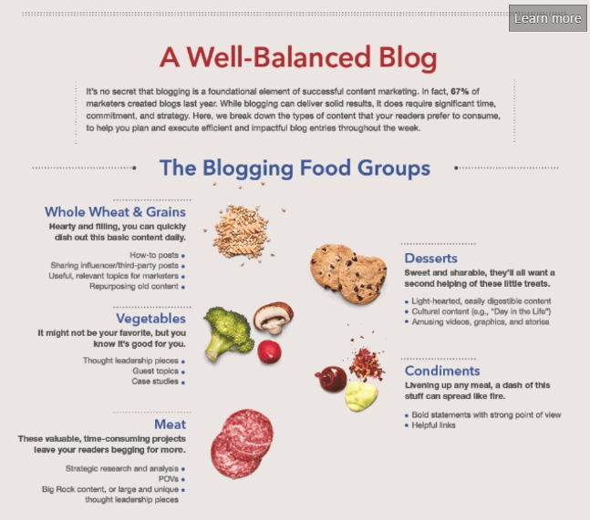
Here’s another example of using photographs (and food references) to display information. This infographic, from LinkedIn Marketing Solutions, based off of content from HubSpot, shows how to create the perfect mix of blog content.
This example from DesignMantic features a pleasing, retro-style design and a warm, slightly muted color palette.
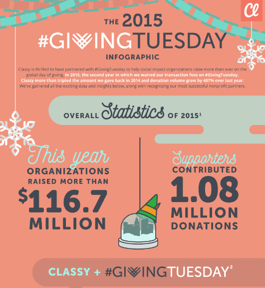
Another important thing to remember about infographic design is that it should bear some resemblance to your branding. This example from Classy shows how fonts and colors in an infographic can match your brand identity.
When you’re ready to design your infographic, you have a lot of options. If you have a graphic designer on staff, work with them to translate your ideas into a graphic. If you don’t have access to an in-house designer, you can find a freelancer or use a web-based infographic-making tool such as Canva or DesignWizard.
The Right Design
Each design approach has pros and cons. The main con to hiring a designer is that their services may be costly, though if you want professional, high-quality design, the cost is probably going to be worth it. Making the infographic yourself will be much cheaper, but if you don’t have strong design skills, the quality of the finished product might not be what you were hoping for.
Whether you get the help of a professional designer or use your own team, it’s a good idea to have a brand style guide. This is a thorough explanation of your brand: the colors, fonts and styles of the company as well as the voice and tone you are trying to portray. Designers will use this as their resource as they create infographics, making the image fit naturally with the rest of your website. This is a great way to develop your brand as you continue to add more content, graphics and videos.
6. A Thorough Review Process
Typos aren’t acceptable in infographics any more than they are in written blog content. Before you deem your picture ready to publish, make sure it has gone through just as much review as any of the other content you put out. In addition to proofing grammar and spelling, make sure that your infographic is fact-checked and has a logical flow.
It can be helpful to pass your content off to someone who’s not as familiar with it for review and to get a sense of how your infographic will be received by your customers.
7. A Promotion Strategy
The best infographics won’t get any traction if you don’t have the right promotion strategy for them. There are several sites that you can submit infographics to for wider reach, and of course, you should include your graphic on your blog, in addition to promoting it on social media and via email. If you create a joint infographic with a business partner, your options for promotion double as you can both use all the options at your disposal to get more eyes on your image.
Start Creating Great Infographics!
Infographics are great as standalone content, as a complement to another piece of content or as a way of recycling old content. They’re attractive, popular, shareable, engaging and can reach and influence people in a way that text content can’t. Use the tips above to come up with great infographic topics and start producing more effective visual content for your company.
And in case you’ve already forgotten what you’ve read, here’s an infographic to remind you of what to include in an infographic:
- Creating Google-Friendly Content - December 31, 2023
- Which Type of Content Brings In the Most Traffic? - December 28, 2023
- Adjusting Your Content for Mobile Searches - December 27, 2023